Good Fairy Experiments
Good Fairy Experiment
This is a quick experiment i completed using several layers. I used vector images i found on the internet and overlaid my leaf images using a soft light. However i quickly realized that it lacked something and i needed a hand drawn image. I need to sketch out some of my flowers and overlay them over the top of my images.
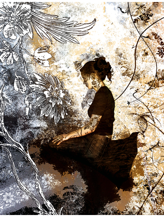
Bad Fairy Experiment
Experiment 1: in the style of Danny Franzreb
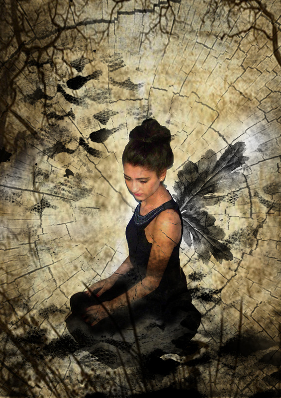
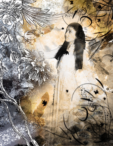
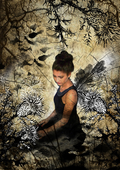
This is my first experiment in the style of Danny Franzreb. I used a series of my own textures and photographs . The background layer is an image of spray painted lace that i created by spray painting lace onto paper. I then scanned this in to the computer to create a base layer. I reduced the blending mode to multiply in order for the image to blend with the other proposed layers. I then added a self portrait in the style of a 'bad fairy'. I used the quick selection tool to remove the background and slightly desaturated the image. I then took my photograph of leaves and removed the backgrounds. I copied two images and used the blending mode soft light to create a transparent layer.I then layered up several other images such as my photographs of lace, wood bark and vignette. When this had been completed i used a variety of blending modes such as soft light, multiply and screen. Using the preset brush tools i created a grass and tree frame to complete the image.
9 layers have been used in this piece. I am pleased as it is my first attempt. However, i would like to add more detailed elements such as flowers to frame each image in the style of Franzreb. The flowers i would like to use must represent the fairies personality. Bad could be represented by poisonous berries, ivy and thistles. The 'good' fairy could be represented by roses, daisies and lavender.
9 layers have been used in this piece. I am pleased as it is my first attempt. However, i would like to add more detailed elements such as flowers to frame each image in the style of Franzreb. The flowers i would like to use must represent the fairies personality. Bad could be represented by poisonous berries, ivy and thistles. The 'good' fairy could be represented by roses, daisies and lavender.
Critical Study on Danny Franzreb...
Danny Franzreb, a 23 year old man who has such a passion
for design and loves what he does. He works for a design and
art direction. His work is very based on interactive projects at
the moment, but he is also does print work and various other
design fields. He had been drawing, taking photographs and
operated electronic devises for all of his life, so he just carried
on growing and developing into what he does today. It started with
skateboarding, graffiti and small digital design jobs. Tabot, the agency
he works under is basically just one big team that all works together.
I have been inspired by this image because of the cross over between fine
art and photography. The photographer has clearly compiled a series of layers
together to create this final piece. I am drawn to the idea of using hand drawn elements
in sync with my own photographs.
The model used has obviously been shot in a studio setting. The background looks as if it is some kind of organic hand made texture such as a mono print. He has then overlaid the image of the model in a sepia tone. The next layer appears to be printed lace. This has worked well with the background layer and adds to the feeling of vintage nostalgia. He has then over laid images of lace that appears to be printed. The final layer is a series of hand drawn flowers and stems that he has placed in the left hand side of the image. On the right hand side you can see vector images of black floral Photoshop flowers.
The colours used are very monotone and appear to be sepia. The limited colour palette of tertiary and monochrome colours have made the work appear vintage. A lot of the images that appear fantasy like are far to twee for my liking. This image has a more serious edge which i would like to recreate in my own work. The layers and colours make me think of old layered advertising or found objects, where you have to 'peel' back the layers to see the final shot. When i first studied this image it reminded me of old Victorian portrait photography and the old death photographs. I think Franzreb has been inspired by this to create this image.
Upon closer inspection, the photographer has used a series of floral patterns and blending modes to create a harmonious composite image. I particularly like the way he has used vintage wallpaper/lace to give the model a floral tatoo. Although this image is quite dark he has managed to retain a feminine edge.
I would like to experiment in this style.Creating images that link with my previous analysis of Cicely Mary Bakers work. Possibly explolring personality, good and evil. Good and evil is often found in fantasy art and stories. This basic outlook represents the positive and negative side of society and if often used to teach young children right from wrong. I would like to explore this avenue further.
Further Texture Experiments
Cicely Mary Baker Exepriments
I took the experiment below using a model from this afternoon and flowers i brought in.I do not think it was very successful because the image appears to be collaged on to the flower. I am going to look at another artist such as Danny Franzreb.
Critical Study on Cicely Mary Barker
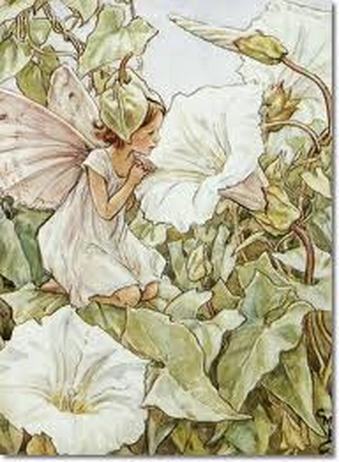
The artist i am going to be look at is called Cicely Mary Baker, she was an English illustrator beet known for a series of fantasy illustrations depicting fairies and flowers. Her art education began in girlhood with correspondence courses and instruction at the Croydon School of Art. Mary Barker is also an illustrator for children's books. She published flowers fairy books with spring, summer and autumn themes (eventually winter too) As its all very magical the artist really wanted us to feel the picture and get very involved with the fairy scene.
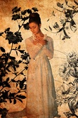
The piece of art I have chosen to write is called ''The White Bindweed Fairy''. In the picture I can see a small girl fairy kneeling down on a lead of flower. In the background there are wild flowers growing as well as in the middle ground and foreground. The illustration is of a young girl wearing a simple white dress. This links with the flower she represents. She wears a flower bud hat on her head and her wings are dusky white/pink. I like how the clothing and fairy represent and compliment the flower she is looking at. The small fairy kneels on a neighboring leaf and peers into the head of the flower. Interestingly the fairy sits in the golden rule of thirds that all photographers use as a guideline. This makes the composition more appealing to the eye.
The colours are muted and soft. It appears as if the artist has used water colour to aid the light, vintage feel of the image. There is no pattern in the image and although is appears full and bustling, it is in fact a simple image in terms of line.Even the large foilage in the foreground of the image lacks significant detail. This allows the viewer to focus on the fairy and the main trumpet flower.
I have been inspired to try and create an image that makes my models small and nymph like. Photoshop will be a great aid for this but i also think it will be quite difficult as it is my first topic. When i have mastered this technique i would like look for a less 'twee' artistic style to combine with this fantasy style topic.
Photoshop edits ....
On these images i used various layers, lighting techniques and gradients to bring a series of seperate layers together.
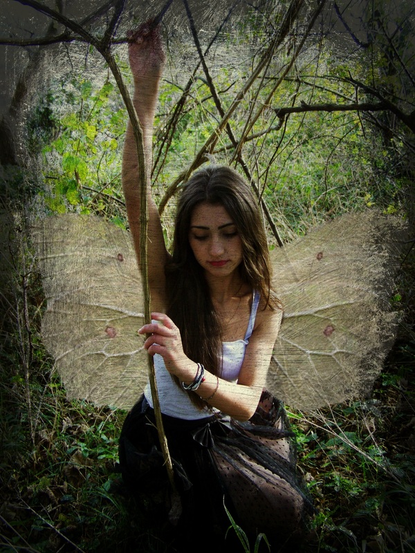
My Initial fairy images taken at the local forest.....
These are my initial fairy photographs. I am planning to edit them by adding fantasy elements. These will include fairy wings, fantasy realms and basic enhancement and cropping.
Inspiration for my fairy photoshoot...
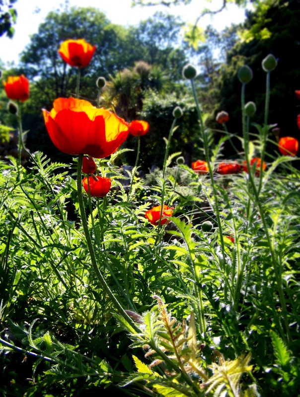
Natural World
I have taken photographs of beautifull flowers in full bloom. I hope to manipulate these images using post production tools to recreate the 'other worldliness' of the Cottingley fairies. In these images i have used a low f number to create depth of field. I think the poppies are particularly successfull because your attention is immediately drawn to the long wispy stems of each flower.
Cottingley Fairies
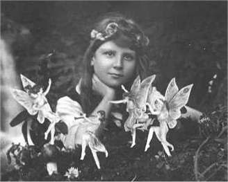
The Cottingley Fairies appear in a series of five photographs taken by
Elsie Wright and Frances Griffiths, two young cousins who lived in Cottingley,
near Bradford in England. In 1917, when the first two photographs were taken, Elsie was 16 years old and Frances was 10. The pictures came to the attention of writer Sir Arthur Conan Doyle, who used them to illustrate an article on fairies he had been commissioned to write for the Christmas 1920 edition of The
Strand Magazine. Conan Doyle, as a spiritualist, was enthusiastic about the photographs, and interpreted them as clear and visible evidence of psychic phenomena. Public reaction was mixed; some accepted the images as genuine, but others believed they had been faked. In the early 1980s Elsie and Frances who were much older admitted that the photographs were faked using cardboard cutouts of fairies copied from a popular children's book of the time, but Frances maintained that the fifth and final photograph was
genuine.
This inspires me because from the early days of home photography image manipulation has been used to present make believe as a reality. It is hard to believe from looking at the images that they were represented as a true reality. However the camera was a fairly new phenomenon and used mainly during the 20's a documentary source. Post production process is now so saturated and comoleted to such a high degree that it is very apparent that these fairies are cardboard cutouts. I have been inspired to look further into fairies, nymphs and elves as they are the mystical little people that children still believe inhabit our countryside. Below you can view the remaining images from these two girls that caused such controversey....
Critical Study on Alex Stoddart
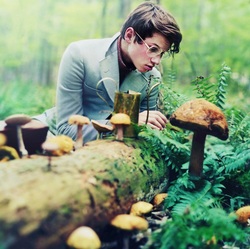
I have decided to look more indepth at the work of Alex Stoddart.
Alex Stoddart is only 18, but he’s already an accomplished
photographer. He is best known for his stunning self-portraits. He was acknowledged as a proffrsional after his
365 project went global on Flikr. This entailed taking a self-portrait photo each day, most often in woodland or
ocean-front surroundings. Stoddard’s recent “work focuses on the human form and the process of infusing it with natural surroundings. He also strives to create whimsical and surreal portraits.”
I have decided to explore the notion of fantasy in landscapes and the natural world. Utilising a combination of organic forms in my work. This image on the left shows the photographer gazing at a wooden mushroom. He has used costume to portray the notion that he is a scientist or possibly as novelist. His clothes are in a 70's retro style. I am unsure as to why he has chosen this otfit as it seems strange in this day and age and is not in keeping with his more organic forms.
The lighting is natural daylight. It appears as if the light is coming from behind the figure on an overcast day. The photographer has also used depth of field to lead the viewers eye to the main figure. The foreground and background are both out of focus. The middleground is the only area that remians in focus with detail. I have been inspire to take my own photographs at a local forest with a model in costume. At this time of year it is quite difficult to plan a shoot due to the weather. However, over the half term i plan to take a model with various costumes to the forest to create a whimsical feel to my work.
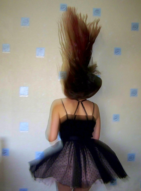
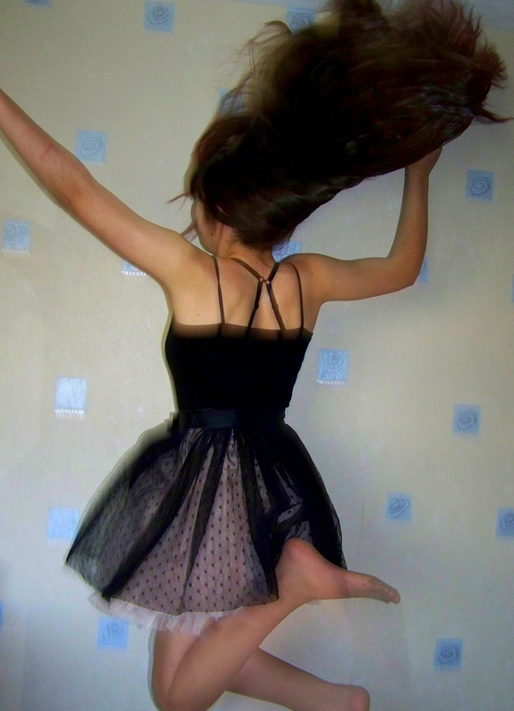
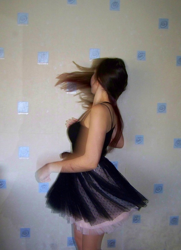
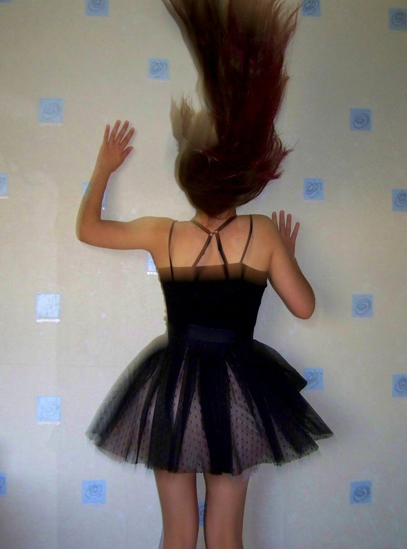
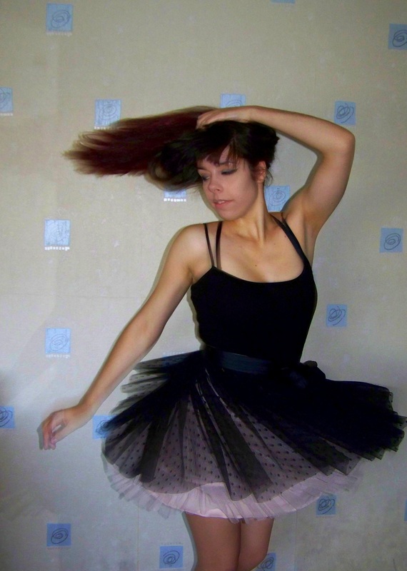
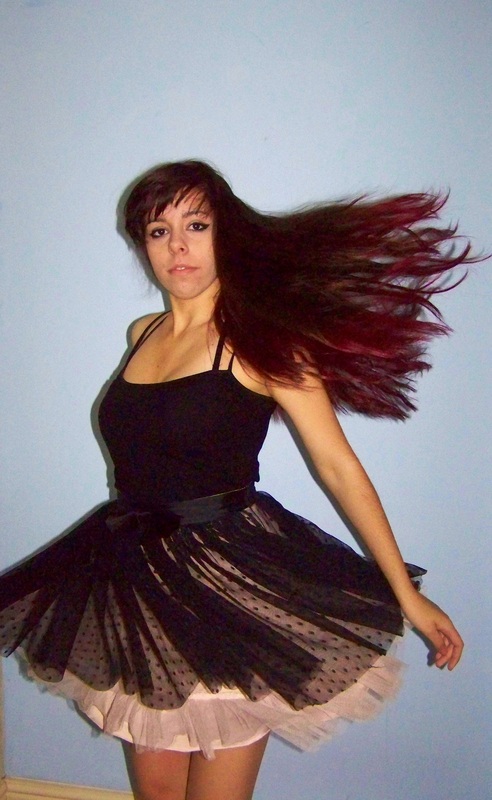
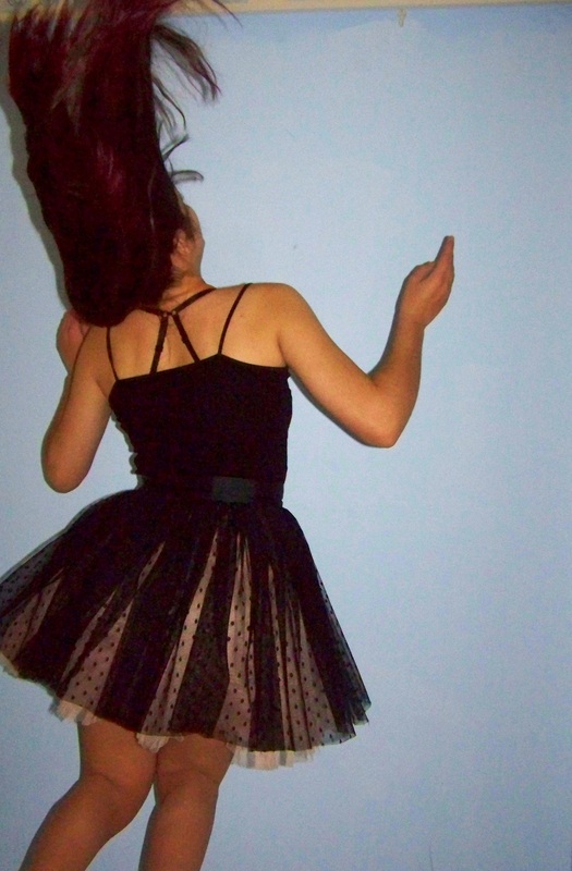
Initial pictures in the style of Brooke Shaden's Ballerina
These are my initial photographs in the style of Brooke Shaden. I am going to experiment with Photoshop to see if i can composite the images together to create a similar scene. I hope to use the blur tool and the mask layer tools. I may rehoot these images again with the hands and feet visible because it may be difficult to composite them together naturally.
Critical Study On Brooke Shaden
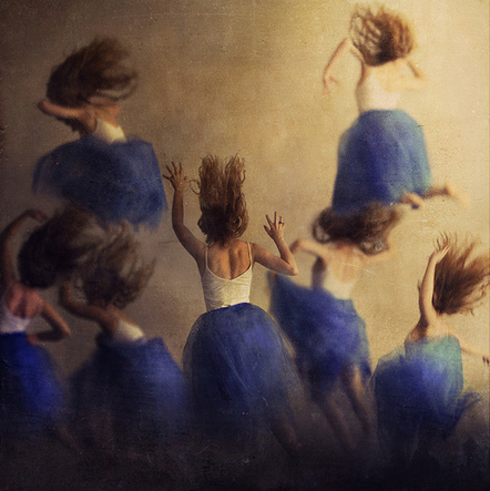
The piece i have choosen to write is called ''Ballet Vacet.''
The photographer who is taken it called Brooke Shaden.
She was born in March of 1987 in Lancaster PA, USA.
Brooke was photographically born in December 2008 after graduating from Temple
with two degrees: film and English.
She began creating self-portraits for ease and to have full control over the
images, and has since grown into a self-portrait artist. Self portraiture for
her is not autobiographical in nature.
Brooke works to create new worlds within her photographic frame. By using
painterly techniques as well as the square format, traditional photographic
properties are replaced by otherworldly elements. Brooke's photography
questions the definition of what it means to be alive.
In the picture i can see a ballet dancer which has been replaced seven times with different positions.This is an impressive and very creative composition with needless to say prefect execution. Watching the image you really feel the movement and the spirit of the ballet.
The figures have been placed on a sandstone coloured background. This contrasts beautifully against the indigo blue tutu. The central figure remains in focus and the remaning figures have been blurred to create the feeling of movement and chaos.In the foreground the photographer has layered several figures together. All the dancers appear to jump towards the left hand side of the image. I like how the photographer has created depth in the image by layering, using opacity levels and building up the background, middleground and foreground. By freezing a moment Shaden aims at a perfect enduring construct, a small universe of meaning. In "Ballet Vacate" Shaden depicts the dancer attempting gracefiul ballet.
I have been inspired to try and recreate a similar composition in order to enable me to create a layered composite.
Personal Project
My choosen question is Fantasy Art. I plan to look at various photographers and artists who deal with the theme Fantasy Art. I will begin this project by looking at various photographers and trying to take my own images in this style. I am particularly interested in the work of Brooke Shaden and Alex Stoddard. I will begin by researching these artists in depth. finding out their influences and ideas.
What i particularly like in the work of Alex Stoddard is the way that he often uses the human body and merges it with natural forms to make the person and the environment one. i would like to experiment with this technique..
